Color plays a crucial role in shaping the atmosphere of our homes. It not only impacts the overall aesthetic but also sets the tone for the comfort and energy we feel in our living spaces.
Today, we're diving into four popular color-pairing techniques that can enhance any room. Whether you're a pro at decorating or just getting started, these methods will help you achieve the perfect balance and style for your home.
1. Monochromatic Color Scheme
A monochromatic color scheme involves using variations of one color throughout a space. This doesn't mean the room has to be boring—different shades, tints, and tones of the same color can add depth and interest. By adjusting the lightness and saturation, we can create a unified yet dynamic look. It's the go-to method for achieving a clean, elegant, and harmonious design.
One of the best things about this style is how it creates a sense of continuity. The colors blend seamlessly, providing a balanced visual experience. To avoid a flat or dull appearance, we can play with textures and materials—think glossy vs. matte finishes, or soft fabrics vs. more structured ones. Even a pop of a contrasting decorative item, like a bright-colored cushion or rug, can break the monotony without disrupting the overall flow.
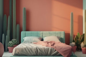
2. Analogous Color Scheme
The analogous color scheme involves using colors that are next to each other on the color wheel. This method brings a smooth, pleasing feel to a space, as the colors share similar undertones. A common approach here is to choose one dominant color and pair it with one or two neighboring hues. For example, pairing red with orange and pink creates a rich, warm palette that has subtle variations while maintaining unity.
This scheme is ideal for creating a calming and cohesive atmosphere. However, we must avoid using too many colors from the same family—this can make the space feel too uniform and lacking in excitement. By keeping the colors in a similar range, we ensure that the room feels balanced without feeling too flat.
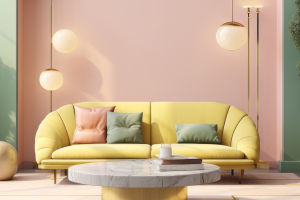
3. Complementary Color Scheme
Complementary colors are located opposite each other on the color wheel. These contrasting hues create vibrant and energetic combinations, which can instantly draw attention. Think of pairing red with green or blue with orange. While this contrast adds a bold, striking effect, it's crucial to balance these colors well to avoid overwhelming the space.
We recommend using one dominant color for the larger areas (like walls or furniture) and adding its complementary color as accents—small pops of the opposite color, like throw pillows or artwork. This technique helps create a focal point and makes the space visually engaging without being too overpowering. The key here is moderation: too much contrast can lead to chaos, so it's best to tone down the intensity of one of the colors.
4. Split-Complementary Color Scheme
A twist on the traditional complementary scheme, the split-complementary method involves using one base color and the two colors adjacent to its complementary color. For instance, if the main color is blue, we might pair it with yellow-orange and red-orange. This pairing provides a high contrast but without the intensity of the direct complementary colors.
The split-complementary scheme is flexible and can add a lot of visual interest to your space. It's ideal if we want to keep the boldness of complementary colors but reduce the harsh contrast. The use of colors adjacent to the complement helps tone things down while still creating dynamic and vibrant effects. When using this method, adjusting the saturation or brightness of the colors can further help achieve the desired balance.
These four color-pairing methods provide diverse ways to approach home decor, depending on the vibe we want to create in our living spaces. By understanding how to balance colors—whether it's through monochromatic harmony or bold contrasts—we can transform any room into a place that reflects our style and personality.
At the end of the day, color sets the mood of a room. So, whether you're going for a serene atmosphere or an energetic vibe, choosing the right color scheme is key to achieving the perfect home. Let's embrace these techniques and experiment with different combinations to create spaces that feel just right.
Feel free to try these color schemes in your own home, Lykkers, and let us know how it turned out! You'd be surprised by how a simple change in color can completely transform a room.